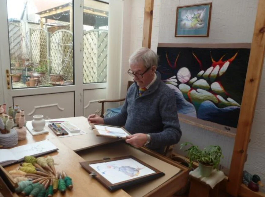
Michael Crompton in his studio, “My day does not begin and end, for my days are round.”
If you visit - no, when you visit Michael Crompton’s website, you’ll find some hidden treasures not only in his work which spans decades, but also in his writings. I don’t know of any other tapestry artist that gives so much of himself in his writings and thoughts.
Several things will strike you as you look through his website. The evolution of his process, his intense involvement with color, recurring themes, symbolism, and a deep love and appreciation for poetry and prose. I feel a kinship in his musings. You may, too.
Setting Sun and the Moon Regains the Freedom of the Sky, Michael Crompton, 2017
Let me start with Color
One of the first articles Michael sent to me was in response to a post I had written on color. He shared with me something he’d written that was first published in "Guild of Weavers, Dyers and Spinners" Journal. I immediately identified with his thoughts on - and method of collecting - color.
The article started with the Nature of Color.
That we see color not in isolation, but in relation to its neighbor.
He talked of his method of yarn wrapping to explore relationships in color and how that approach allows him to explore color contrasts and harmonies, “to vary the amount of a particular colour to achieve weight of tone and hue. All the time learning how individual colours react to one another.”
He went on to say that in his earlier weavings (early 1960’s) he used a much smaller number of colors, textures and fibers- but presently he incorporates 80 to 90 in his work. In those early days, because he was not able or willing to dye his own yarn, much time was spent searching for the right yarns for a particular design.
With too many ideas to continue to source yarns one tapestry at a time, he began to search for a better way. He says …
“My solution was both simple and very effective. I created my own yarn store.”
“As a tapestry weaver I require many, many different colours in small quantities and even the tiniest amount can make a contribution. At first I put similar colours together but gradually over the years prefer now to have them mixed. This gave me the opportunity to access contrasting and harmonious tones next to each other. Thus giving my colour appreciation a boost…Just as the artist can mix and create so many tones and hues from his paints this solution works well for me. When I look back the expense and effort in collecting yarns has proved invaluable.”
And he ended with this advice:
“Find yarns that you are happy with and make the investment. Start collecting and storing and build a personal resource, one which give you added impetus and immediacy to your weaving.”
He also mentioned how as his thoughts began to turn to incorporating more color into his weaving, he felt restricted by the hacheur method and so developed a method of his own: the lozenges.
And about those lozenges… they not only represent (to me) his greater exploration of color, but a wonderful solution to his denial of straight lines.
Curved lines
We see them even in those lozenges.
He rejects straight lines for their lack of movement, restraint and formality.
“In all my work I concentrate on the curved line. A curve line denotes movement and hence time. My themes and concepts often revolve around past time, present time and future time and include the transitions from one season to another, and the cycles of both the sun and the moon.”
Symbolism
Symbolism is an important aspect in his work; in color, the spiritual, the natural world.
He is also deeply moved by poetry and the link between the spiritual and physical world.
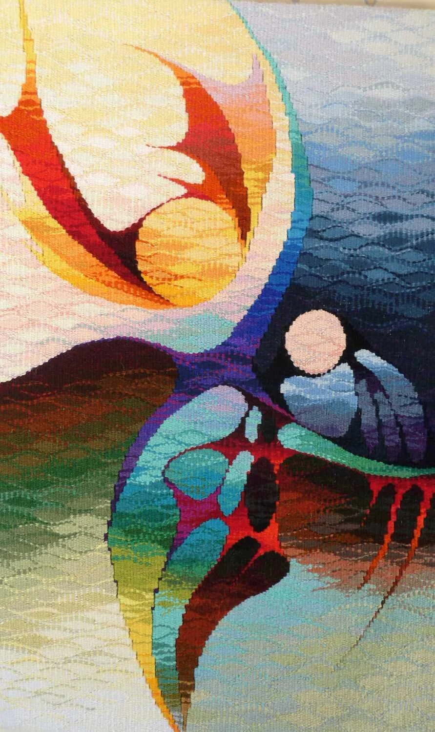
Sun and Moon in Conflict, Michael Crompton, 2017
The Sun and the Moon
Light and Dark
Michael writes in a recent article published in Weavers’ Bazaar’s January 2021 newsletter:
“Living by the coast and with fine views across the Bay to the South Lakeland fells the natural world and the effects of the Sun and Moon have long been a valuable source of inspiration”
We see this imagery in many of his works.
Here’s an excerpt from We Circle the Seasons:
… I am all too aware of the role played by the Sun and Moon respectively. The feminine Moon is symbolic, it is universally understood to represent the rhythms of time, past time, present time and future time as it embraces the cycle. Moon phases symbolise immortality and eternity, enlightenment and even the darker side of nature. The middle ground between light and dark, day and night often represents the realm between conscious and the unconscious. The phases of the Moon offer an analogy for the stages of development of human life. For the new Moon is the start of growth, of infancy; while the crescent Moon is representative of youth and of adolescence. It is the full Moon which shows maturity while finally the waning Moon represents the decline of life towards sleep and death.
“As in many other of my tapestries I have to include the sensation of light, the epitome of seeing and knowing. From the unknown, the dark night, to the known and the brilliant illumination of knowledge, understanding and possible enlightenment. For light comes from the future, looking always ahead at what is over the next horizon or around the corner we leave behind the past. Yet its experiences will affect how we see and view the oncoming.”
He writes more extensively of this link in his treatise Ganga and the River of Life.
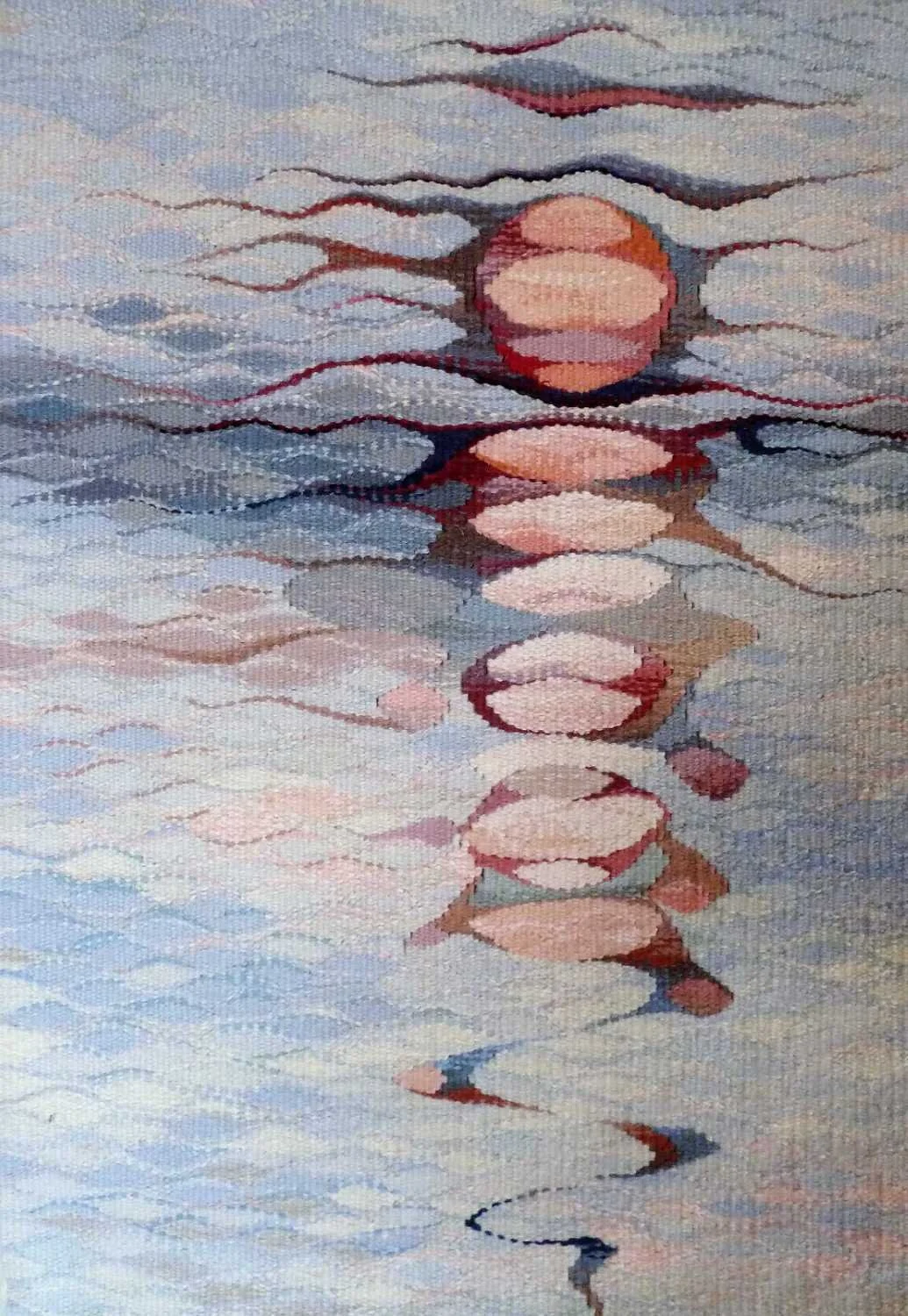
Setting Sun on a Silvery Stream, Michael Crompton 2014
The link between the spiritual and the physical world
Perhaps most of all, his emphasis of the link between the spiritual and the physical world speaks to me.
Michael calls this the “tingle zone” - where the spiritual and the physical world meet.
“Whether it be the deserts, the high mountains, the snows on the Northern fells, the volcanic beaches of an Atlantic island, the claustrophobic underground caverns of the limestone regions are locations which are special and have always attracted me. To be alone concentrates the experience, it highlights the intensity of the occasion and adds beauty to life.”
I was particularly drawn to the Ganga tapestry (above) and moved in reading Ganga and the River of Life.
So moved, in fact, I actually felt the tingle zone as I read his description of the water, the stillness, the beauty - all through the eyes of color.
“The earth, the sky and the water were now united into a single palette…silver grey waters … in an auditorium of platinum, silver greys, blue greys and with a hint of magenta… soft flesh pinks, apricot and deep salmon tints…”
And then he also writes in These Mountains Belong to the Gods…
“Nepal and the High places are half way to Heaven The dominant religions in Nepal are Buddhism and Hinduism which emanates from the natural world. Each of the five elements is associated by a colour, earth and the land with green, the air with white, fire with red, blue with water and yellow and orange with religion and enlightenment. This colour scheme is commonly found the country and especially with the wind prayer flags which drape the many religious sites and temples, along with houses and other buildings… “
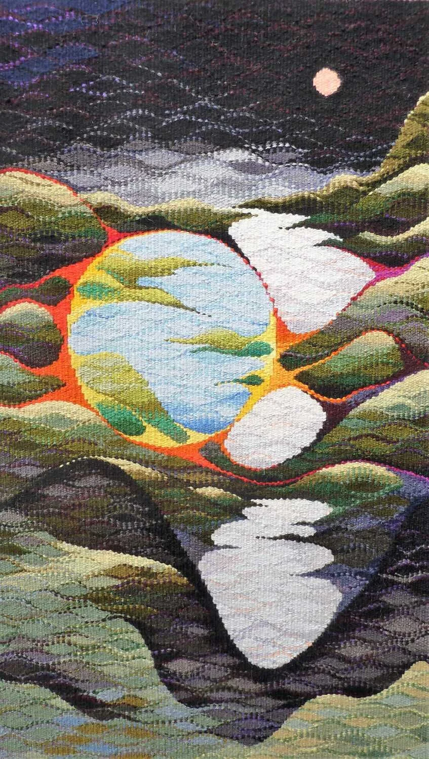
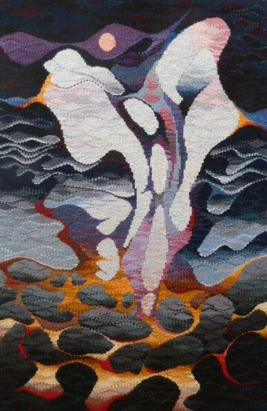
“Loneliness expresses the pain of being alone but solitude conveys the glory of being alone”- The Beach of Lost Souls, Michael Crompton, 2019
The days are round
One of Michael’s favorite quotes.
Michael also shares a special loom he’s designed over the years to work best for him. In his generous spirit, he shares the plans for the loom so that weavers can make their own on his website.
Want to read more?
Recently, Michael had a wonderful article in the weavers bazaar newsletter on his day in the studio: A Day in the Weave …Michael Crompton
