These are some of the random notes I’ve made over time in my weaving journals. It’s not intended to be a scholarly article and references are noted where they apply. This is a work in progress. I still have more to add and will include as I have time.
Random notes
Cool colors recede and appear to be more distant.
Warmer colors seem closer and have the appearance of floating forward.
Warm colors tend to look lighter than they are.
Cool colors tend to look darker than they are.
Highly saturated colors tend to look lighter than they are.
Less saturated colors tend to look darker than they are.
An outline in black or white intensifies the colors it surrounds.
Combination of colors next to each other appear to change the hue, value, or intensity. Two colors touching will blend and appear dissimilar.
Complements
Using the same values of compliments will grey.
Using complements instead of a dyed grey yarn will liven the bundle up. Adding one strand of a dyed grey can enhance the appearance of grey.
From Weaving as an Art Form by Theo Moorman
2 complimentary colors in large areas seen individually seem to vibrate. In smaller units the effect can be disconcerting, discord, friction. But if woven so fine that the 2 colors are blended to the eye, the effect is quite different. Moorman notes she uses 80/2 cotton in primaries and secondary colors along with grey scale, black and white and achieves any color she imagines.
From Small Woven Tapestries by Mary Rhodes:
Green will appear darker and bluer next to yellow. Green will appear lighter and more yellow next to blue. Green will appear greener against pink than another green.Red will appear more intense next to green. Pink will appear pale next to red, but richer beside green. A neutral grey will appear pinkish next to green and greenish next to red.
From Tapestry Handbook the Next Generation by Carol K Russell
Combining a strong hue or value contrast will give you a textured look rather than a blend. Minimal variation in hue or value are smoothest.
Darkest black and bright whites tend to dominate but warm beiges or cool grey blend more successfully with hues or other neutrals.
“A light pastel color appears relatively lighter used with a very dark color, while the same pastel seems shaded next to off white. Magenta appears hot next to an icy blue though much cooler next to bright pink. Dull rose becomes more drab combined with vivid turquoise but appears warm and lively used with soft blue.”
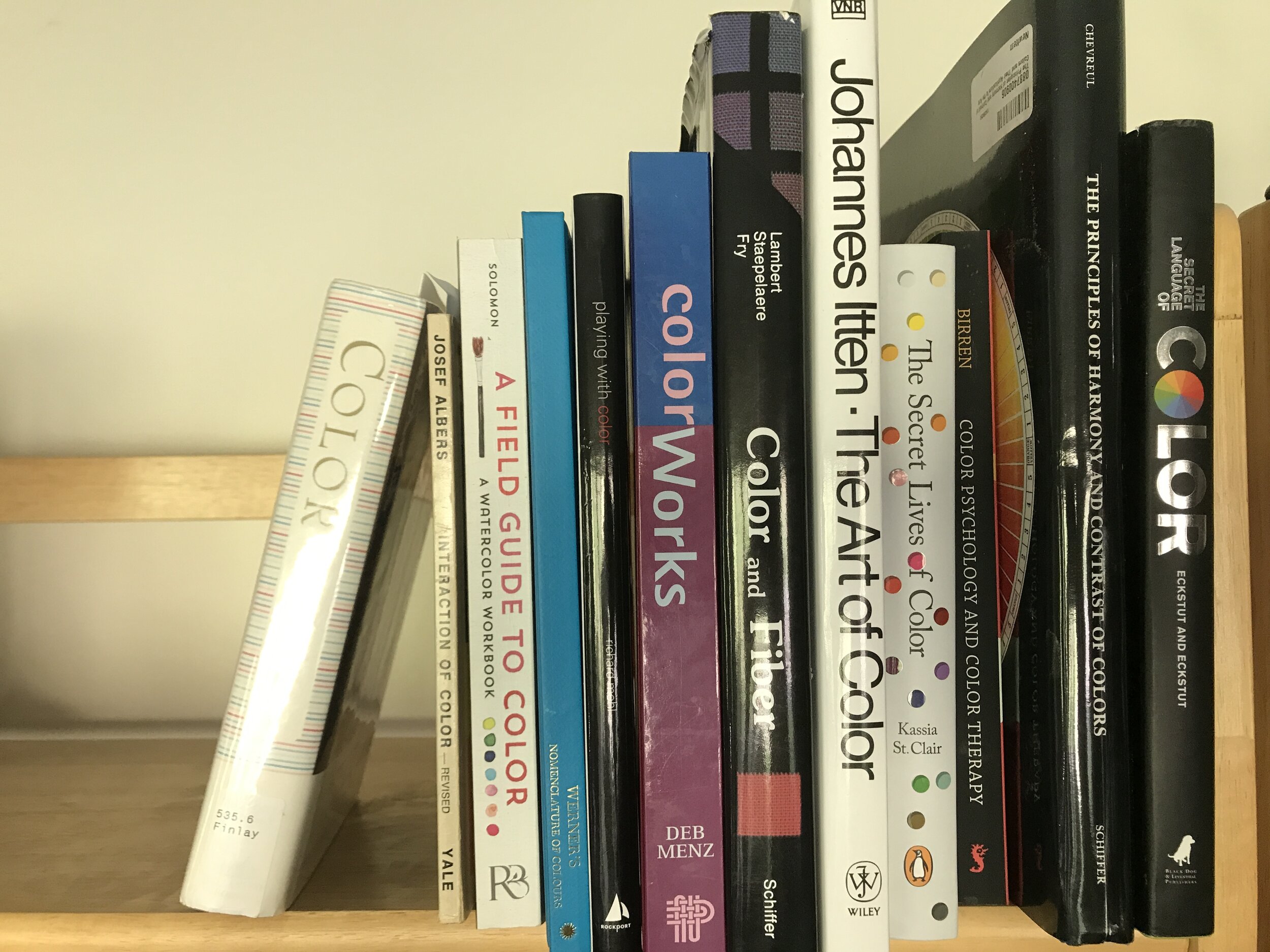
*References:
Interaction of color - Joseph Albers
The Art of Color- Johannes Itten
The Principles of Harmony and Contrast of Color- M. E. Chevreul
The Secret Language of Color- Joann and Arielle Eckstut
The Secret Lives of Color- Kassia St. Clair
Color Physiology and Color Therapy- Faber Birren
Color and Fiber- Patricia Lambert
ColorWorks- Deb Menz
Playing with Color-Richard Mehl
Werners Nomenclature of Color- Patrick Syme
A Field Guide to Color- Lisa Solomon
Color, a Natural History of the Palette- Victoria Finlay
Small Woven Tapestries- Mary Rhodes
Weaving as an Art Form: A Personal Statement- Theo Moorman
Tapestry Handbook, the Next Generation- Carol K. Russell
American Tapestry Alliance website - search for color
Kathe Todd-Hooker’s article on ATA website
*Some of these links are affiliate links and I receive a small compensation when you order from that link.
